Redesigning Insperity's Business Blog
A redesign of Insperity's business blog to provide valuable learning materials and engaging reading experience.
My role & my team
I am the lead UX Designer working with 5 PMs, 6 managers, 7 developers, 3 tech writers, and 2 marketing coordinators
Challenge
I am the lead UX Designer working with 5 PMs, 6 managers, 7 developers, 3 tech writers, and 2 marketing coordinators
Goal
I am the lead UX Designer working with 5 PMs, 6 managers, 7 developers, 3 tech writers, and 2 marketing coordinators
I collaborated with the data analytics team and front-end engineering team to conduct an audit on 2 years of site data and 300+ survey responses. The data revealed that visitors came to the blog for the content, but left because of the poor reading experience. The experience of the blog is not compelling enough to convince visitors to stay, needless to say subscribe to it.
Too many pop-ups forced visitors to leave site early
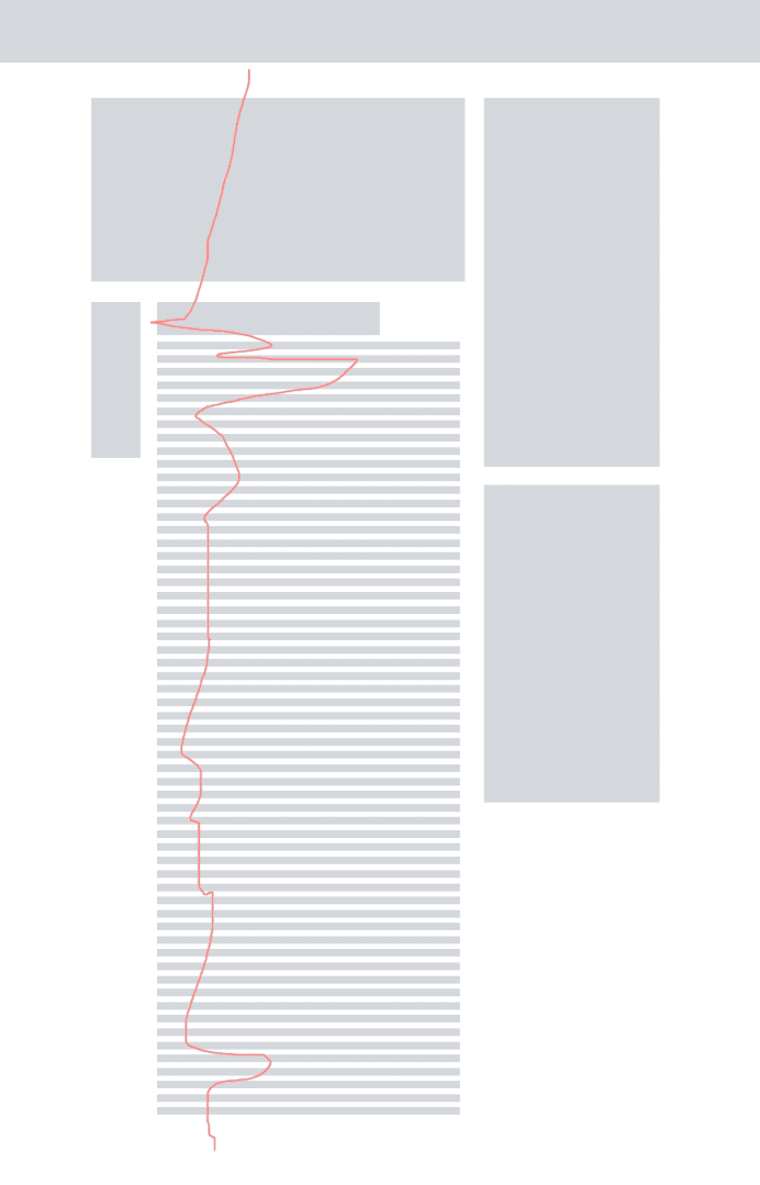
Site traffic data shows that individual blog posts attract the most visitors, not the blog homepage. Heatmap shows that only 5% of the visitors scrolled to the bottom of a blog post, and visitors' mouse movement shows that they were not interested in any side rail content.

The Blog Layout Can't Compete with the Best Practices in the Market
With blogging become a mature medium for knowledge sharing, visitors don't have to tolerate bad reading experience. Medium demonstrates what an engaging reading environment can be, and even conversion rate focused business like Hubspot renovated their blog to focus on content, not sales pitches with constant popups.
Users expectations are evolving and becoming more sophisticated and demanding. We needed to keep up.
To create an engaging reading experience, I led the team to redefine promotional popup logic and align on a set of designs that focus on the content.
Optimize the page layout
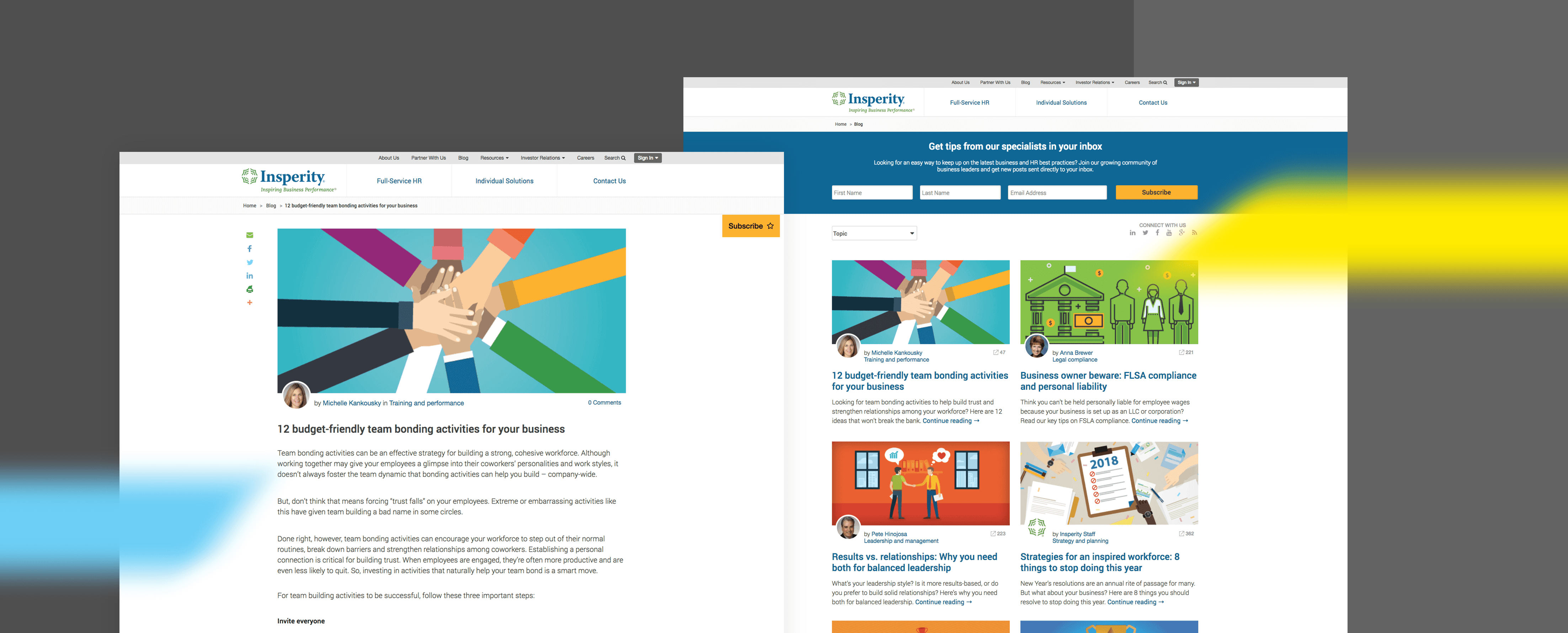
Blog design best practices demonstrates the value of a clean blog layout. I decided to remove all side rails content on the blog post and revamp the design for both the blog homepage and blog posts.
Before

After
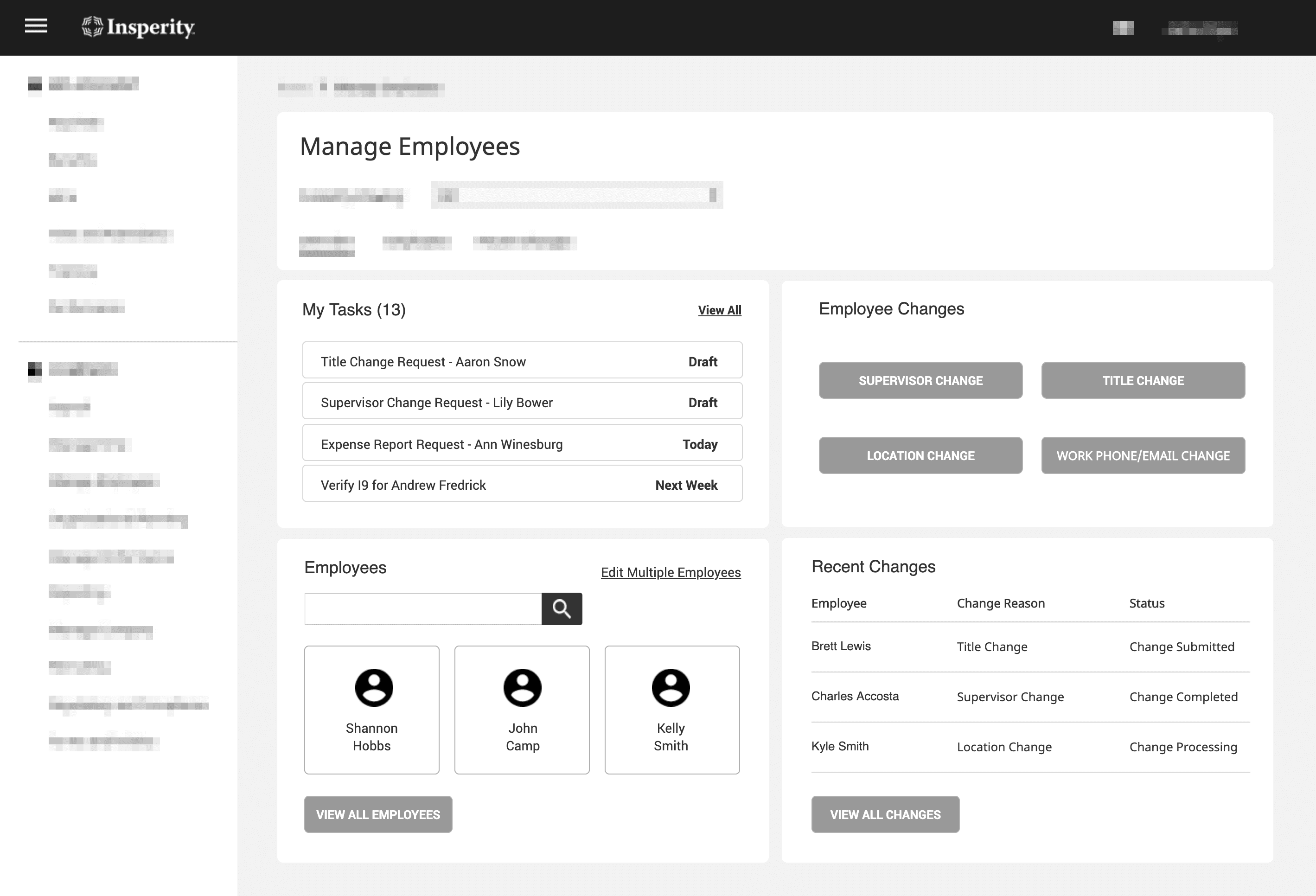
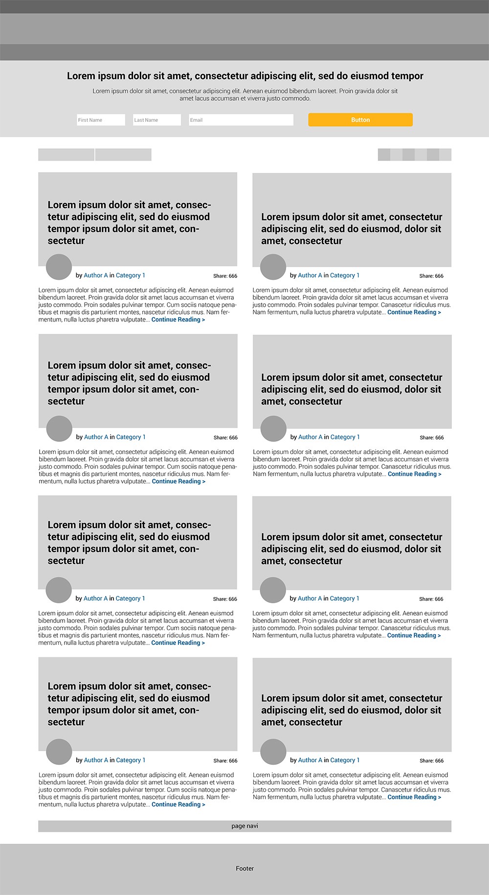
Improved information architecture
The new homepage uses a two-column layout to surface more content with less scrolling.
Before

After
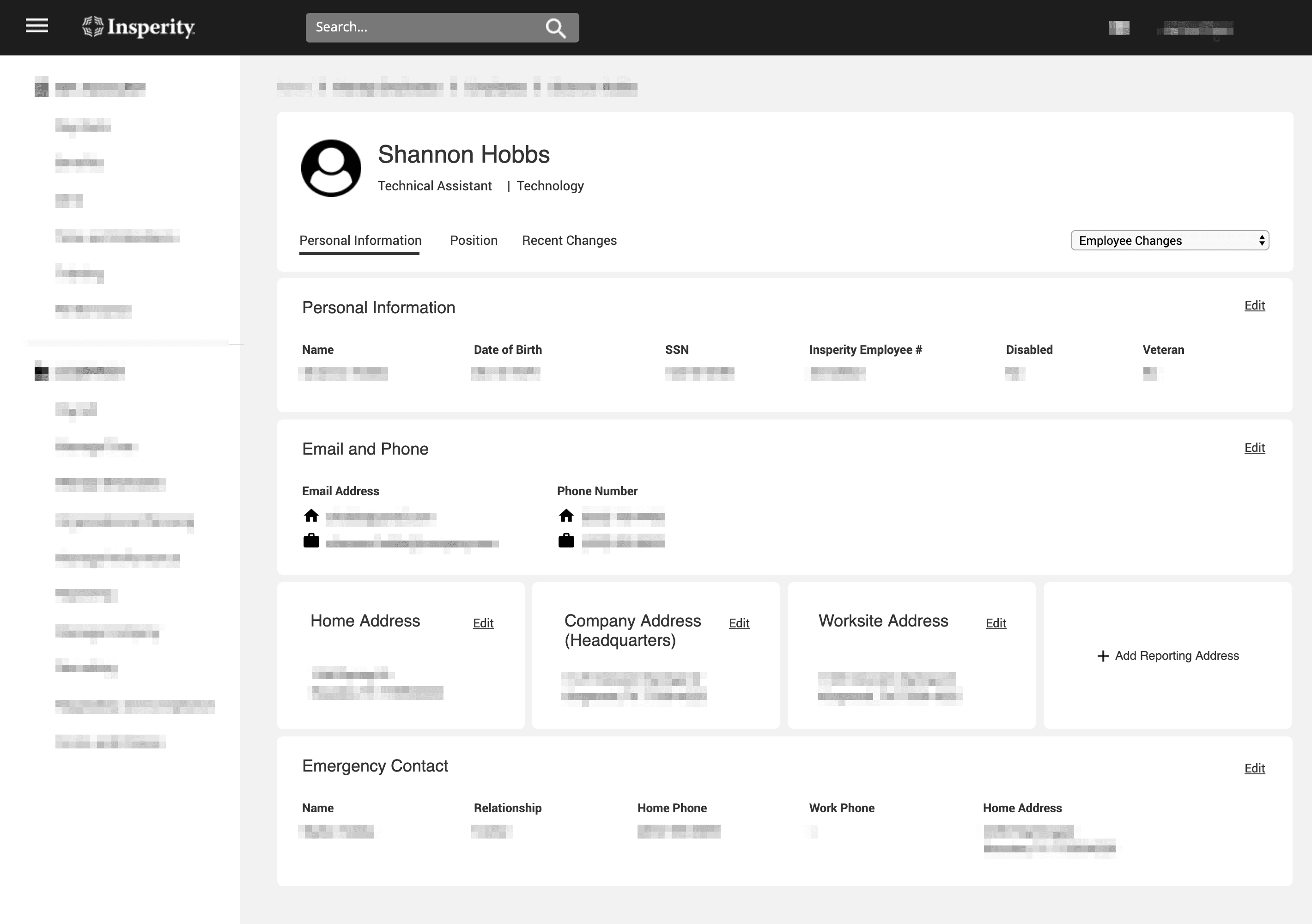
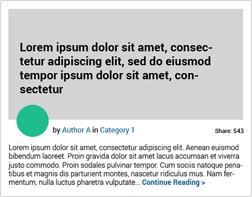
For individual blog posts, I reinforced authorship with surfacing the author's profile picture and adopted one-column layout to create a more engaging reading environment.
Before
After

A user-centric information architecture
A user-centric information architecture